Using Data Visualization to Spot Underperformance in the Portfolio Early ---
Aug 7, 2025
In private equity, catching underperformance after the quarter ends is too late. To protect returns, firms need to identify red flags in real time—and act fast.
That’s where data visualization becomes a game-changer.
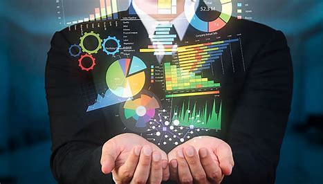
Dashboards and visual tools don’t just display numbers—they highlight patterns, anomalies, and risks that would otherwise go unnoticed in spreadsheets. The goal? Early detection. Proactive response. Stronger outcomes.
How Visualization Helps Spot Underperformance:
- Trend Lines & Variance Charts: Visualizing actuals vs. forecast across revenue, EBITDA, or churn helps highlight deviations the moment they emerge—not weeks later.
- KPI Heatmaps: Heatmaps compare KPIs across portfolio companies or business units, using color gradients to flag outliers. This enables quick scanning to spot lagging performers or regions in distress relative to portfolio norms.
- Performance Alerts: Dashboards with built-in alerts (e.g., in Tableau, Power BI, or iLEVEL) automatically trigger warnings when metrics breach thresholds. These alerts turn static data into actionable insights—empowering GPs to act fast.
- Time-Series Analysis: Layering in historical data reveals recurring drops (e.g., seasonal dips or post-M&A drag) so GPs can predict underperformance before it hits.
- Correlation Visuals: By visualizing the relationship between metrics (e.g., hiring vs. revenue growth), teams can pinpoint operational inefficiencies or misaligned spend early.
The Takeaway:
When it comes to portfolio performance, you can’t fix what you can’t see.
Smart visualization gives GPs the early warning signals they need to protect alpha.
At The PeEdge, we help PE firms design real-time dashboards and visual alerts that turn lagging reports into proactive insights.
Want to spot issues before they impact returns? Let’s talk.